When building applications that display untrusted content, security designers have a major problem— if an attacker has full control of a block of pixels, he can make those pixels look like anything he wants, including the UI of the application itself. He can then induce the user to undertake an unsafe action, and a user will be none the wiser.
In web browsers, the browser itself usually controls the top of the window, while pixels under the top are under control of the site. I’ve recently heard this called the line of death:

If a user trusts pixels above the line of death, the thinking goes, they’ll be safe, but if they can be convinced to trust the pixels below the line, they’re gonna die.
Unfortunately, this crucial demarcation isn’t explicitly pointed out to the user, and even more unfortunately, it’s not an absolute.
For instance, because the area above the LoD is so small, sometimes more space is needed to display trusted UI. Chrome attempts to resolve this by showing a little chevron that crosses the LoD:

…because untrusted markup cannot cross the LoD. Unfortunately, as you can see in the screenshot, the treatment is inconsistent; in the PageInfo flyout, the chevron points to the bottom of the lock and the PageInfo box overlaps the LoD, while in the Permission flyout the chevron points to the bottom of the omnibox and the Permission box only abuts the LoD. Sometimes, the chevron is omitted, as in the case of Authentication dialogs, and as of Chrome 70, the chevron appears to have been removed entirely for all UI.
Alas, even when it was in Chrome, the chevron is subtle, and I expect most users will fall for a faked chevron, like some sites have started to use1:

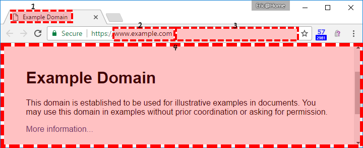
The bigger problem is that some attacker data is allowed above the LoD; while trusting the content below the LoD will kill your security, there are also areas of death above the line. A more accurate Zones of Death map might look like this:

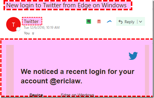
In Zone 1, the attacker’s chosen icon and page title are shown. This information is controlled fully by the attacker and thus may consist entirely of deceptive content and lies.
In Zone 2, the attacker’s domain name is shown. Some information security pros will argue that this is the only “trustworthy” component of the URL, insofar as if the URL is HTTPS then the domain correctly identifies the site to which you’re connected. Unfortunately, your idea of trustworthy might be different than the experts’; https://paypal-account.com/ may really be the domain you loaded, but it has no relationship with the legitimate payment service found at https://paypal.com.
The path component of the URL in Zone 3 is fully untrustworthy; the URL http://account-update.com/paypal.com/ has nothing to do with Paypal either, and while spoofing here is less convincing, it also may be harder for the good guys to block because the spoofing content is not found in DNS nor does it create any records in Certificate Transparency logs.
Zone 4 is the web content area. Nothing in this area is to be believed. Unfortunately, on windowed operating systems, this is worse than it sounds, because it creates the possibility of picture-in-picture attacks, where an entire browser window, including its trusted pixels, can be faked:

When hearing of picture-in-picture attacks, many people immediately brainstorm defenses; many related to personalization. For instance, if you run your OS or browser with a custom theme, the thinking goes, you won’t be fooled. Unfortunately, there’s evidence that that just isn’t the case.
Story time
Back in 2007 as the IE team was launching Extended Validation (EV) certificates, Microsoft Research was publishing a paper calling into question their effectiveness. A Fortune 500 financial company came to visit the IE team as they evaluated whether they wanted to go into the EV Certificate Authority business. They were excited about the prospect (as were we, since they were a well-known-name with natural synergies) but they noted that they thought the picture-in-picture problem was a fatal flaw.
I was defensive– “It’s interesting,” I conceded, “but I don’t think it’s a very plausible attack.”
They retorted “Well, we passed this screenshot around our entire information security department, and nobody could tell it’s a picture-in-picture attack. Can you?” they slid an 8.5×11 color print across the table.
“Of course!” I said, immediately relieved. I quickly grew gravely depressed as I realized the implications of the fact that they couldn’t tell the difference.
“How?” they demanded.
“It’s a picture of an IE7 browser running on Windows Vista in the transparent Aero Glass theme with a page containing a JPEG of an IE7 browser running on Windows XP in the Luna-aka-Fisher Price theme?” I pointed out.
“Oh. Huh.” they noted as they reexamined the picture.
My thoughts of using browser personalization as an effective mitigation died that day.
Other mitigations were proposed; one CA built an extension where hovering over the EV Lock Icon (“Trust Badge”) would dim the entire screen except for the badge. One team proposed using image analysis to scan the current webpage for anything that looked like a fake EV badge.
Personally, my favorite approach was Tyler Close’s idea that the browser should use PetNames for site identity– think of them as a Gravatar icon for salted certificate hashes– not only would they make every HTTPS site’s identity look unique to each user, but this could also be used as a means of detecting fraudulent or misissued certificates (in a world before we had certificate transparency).
The Future is Here … and It’s Worse
HTML5 adds a Fullscreen API, which means the Zone of Death looks like this:
The Metro/Immersive/Modern mode of Internet Explorer in Windows 8 suffered from the same problem; because it was designed with a philosophy of “content over chrome”, there were no reliable trustworthy pixels. I begged for a persistent trustbadge to adorn the bottom-right of the screen (showing a security origin and a lock) but was overruled. One enterprising security tester in Windows made a visually-perfect spoofing site of Paypal, where even the user gestures that displayed the ephemeral browser UI were intercepted and fake indicators were shown. It was terrifying stuff, mitigated only by the hope that no one would use the new mode. (Example POC)
Virtually all mobile operating systems suffer from the same issue– due to UI space constraints, there are no trustworthy pixels, allowing any application to spoof another application or the operating system itself. Historically, some operating systems have attempted to mitigate the problem by introducing a secure user gesture (on Windows, it’s Ctrl+Alt+Delete) that always shows trusted UI, but such measures tend to confuse users (limiting their effectiveness) and often get “optimized away” when the UX team’s designers get ahold of the product.
It will be interesting to see how WebVR tries to address this problem on an even grander scale.
Update: PWA Window Controls Overlay
As of Microsoft Edge version 105, Web Applications that are installed as Progressive Web Applications can utilize a new feature whereby the app’s author controls nearly every pixel of the window, much like a traditional native code app:
You can read more about this capability in the Edge team’s Window Overlay Controls blog post. From an attacker’s point-of-view, this new PWA capability has a pretty high barrier to entry– to abuse it, you must already have convinced the user to “install” your malicious app, and if you could do that, you likely could’ve gotten them to undertake other dangerous operations instead.
Beyond Browsers
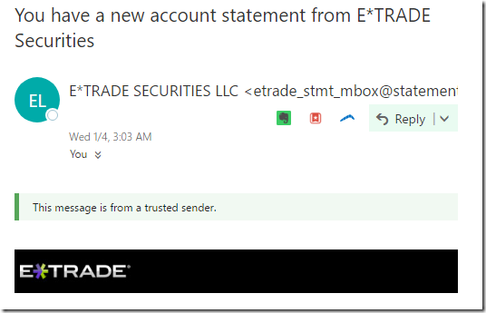
Of course, other applications have the concept of a LoD as well, including web applications. Unfortunately, they often get this wrong. Consider Outlook.com’s rendering of an email:

When Outlook has received an email from a trusted sender, they notify the user via a “This message is from a trusted sender.” notice. Which appears directly inside a Zone of Death:

Enterprising phishers have taken advantage of this and generate their own fake “trusted sender” notifications atop their phishing content. Similar attacks exist against email-signing mechanisms.
Security UI is hard.
December 2022 Update: Chrome Security UX boss Emily Stark provides thoughts on this topic in her blog post.
-Eric
1 “Why would they fake a permission prompt? What would they gain?” you ask? Because for a real permission prompt, if you click Block, they can never ask you again, while with a fake prompt, they can spam you as much as they like. On the other hand, if you click Allow, they immediately present the real prompt.

Isn’t even the address bar domain name no longer trustworthy because of HTML5 push state navigation? Or is the domain protected from that?
Right, pushState() cannot control the origin components (scheme, domain, port), only the path, query, and fragment.
I found this article fascinating. I think the problem with space saving UIs can also be seen in browsers where the UI disappears once you begin scrolling, such as Chrome for mobile. Google could solve this issue if they used Android notifications to display the security status in the notification bar. However, this wouldn’t be effective if the website put the browser into fullscreen and the user failed to notice the fullscreen notification.
Like the article very much,thank you for sharing the spirit, and this article give us an comfortable reading experience.
May I ask you to translate this article into Chinese, please be assured that I will not use it for business, and I’m sure that I will retain the original link.
Finally, thanks again.
Best Regard.
Sure go ahead.
I wonder how the Opera Neon concept browser will deal with the LOD.
Even as an seasoned expert in this area, I’ve caught myself about to interact with a clearly faked UI component. It was just my muscle memory reacting to a simple Ok/Cancel prompt and I knew it was fake, but my arm moved for it nonetheless before I stopped.
That was a spooky read.
I think I’ll tell my friends (if I had any) to start using chrome themes with some hideous changes to teach them how to distinguish real and fake.
Thanks for the information.
Is it possible to write a Chrome extension that displays the certificate chain? That way, if we knew the CA that validated our bank, we could verify the CA with a single click.
Not today, and doing so can be a bit complicated (because multiple certs can make up one page; see the Security tab in the Developer Tools). But there are requests for this capability in the extension API set; see https://crbug.com/641265
Gmail’s UI on email attachments is also affected, way worse than Outlook’s example. I had so many people clicking fake attachment image that’s just unbelievable. While it’s not ‘line of death’ directly, it’s same problem – hacky content shown in area that’s (wrongly) considered as trustworthy.
Love the article. :)
Fantastic article. I’m wondering if there should be a 5th “Zone of Death” around the browser plugin icons to the right of the URL bar. Although (as far as I know) the content of these cannot be affected by the currently loaded URL, they cannot necessarily be considered safe pixels in the browser UI.
I’d considered that, but it’s also the case that these pixels are ones that are supposed to be protected from untrusted web content, and there are explicit prompts about installing extensions. That’s not to say that any given extension might not show untrusted content in its icon.
One the best sec article I’ve come across in the recent times!
It’s possible to clickjack the trusted UI (browser) with custom CSS cursors : http://www.phpied.com/custom-animated-cursor-via-canvas/
Yes. This is more appropriately considered a bug, rather than a design problem. See https://bugs.chromium.org/p/chromium/issues/detail?id=640227 and its related issues.
This is why you cant’t go fullscreen in Qubes OS by default.
https://www.qubes-os.org/doc/full-screen-mode/